This week we have launched a new website - it’s the latest version of the site for Sue Heron who is an artist based in Huddersfield. Sue specialises in painting landscapes, people and animals.
This is the second website we have created for Sue and in this new version Sue was keen to change the background colour to black so as to make the artwork stand out more from the page. The design has been simplified so as to place the focus firmly on the paintings that Sue creates and there is very little colour on the site other than that provided by the art.
As with all the sites we produce these days, Sue’s website works well and looks good on desktop screens, laptops, tablets and mobile phones. The layout of the pages adapts itself to the screen width so that the text is easily readable on screens of all sizes. In the image below you will be able to see how the design for one of the gallery pages changes according to screen size.
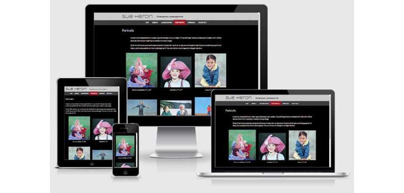
On wider screens the artwork is displayed in three columns, on a tablet there are two columns and on a phone the paintings are set in a single column. In addition to ensuring the layout works well on all screen sizes, we have worked hard to ensure performance is optimised. This is particularly important for devices which are connected over mobile networks which are significantly slower than broadband. We have compressed the images and the code as much as we can so as to minimise the amount of data that has to be transferred from the server to the screen. This is one of several techniques necessary to ensure great performance.
Do have a look at the new website for Sue Heron and feel free to let us have your comments below.