Summary
Abandoned carts in your online shop mean lost income. Below we examine the reasons why customers abandon their purchases and look at 8 actions you can take to improve the checkout process to reduce the percentage of people who fail to complete their purchase.
Intro
If you run an online shop, I’m fairly sure you’ll have come across the idea of abandoned carts. If not, here’s a quick summary - an abandoned cart is where a customer places one or more items in their basket (or cart, if you prefer) but then doesn’t checkout.
Clearly, we would like the percentage of abandoned carts to be as low as possible. It’s unlikely ever to drop to nothing because there will always be ‘window shoppers’ who add items to the cart but really they aren’t yet ready to buy.
If you have an email address for the customers who have abandoned, sending them an email to prompt them to checkout can be productive and recover some income that might otherwise be lost.
Putting aside the customers who are window shopping, why do the remainder abandon their carts? There’s some great research on this from the Baymard Institute who have collated data which shows that, on average, the cart abandonment percentage is around 70%. That’s right, nearly 70% of shoppers abandon their online shopping and fail to make a purchase. To be fair, this percentage does include the window shoppers.
The Baymard Institute surveyed over 4000 shoppers to discover why they abandoned their carts. The summary of their research is in the graphic below.

If we can deal with the reasons for cart abandonment, surely we can sell more and provide a much more satisfactory experience for our customers.
Optimising the Basket/checkout process
Based on the above, the ideas for optimising the checkout process split into 2 groups:
- Actions you can take to adjust the checkout process to make it as smooth and easy as possible for people to buy from you
- Information you can provide to customers during checkout that will reassure them and increase their confidence in your business.
More details below.
Making the process smooth
Don’t force people to create an account
Forcing customers to create an account is a major stumbling block in the checkout flow. Of course, I understand why a business would want to capture customer email addresses, but it’s best not to require that customers do so.
By all means, offer the option for people to create an account to save name and address details to speed up subsequent purchases, but don’t make it mandatory or you’ll lose customers. If you are going to offer the ability to create an account, consider whether to offer sign in via Google, Facebook etc as well as creating a specific user and password for your site.
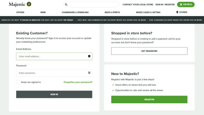
In the screenshot below, Majestic Wine require customers to create an account. There’s no option to checkout as a guest. I suspect there are plenty of potential customers who choose not to procced at this point in the process.
Offer different payment methods
Rather than just a single payment method, offer alternatives. Most ecommerce sites offer payment by PayPal and credit card. Consider the option of offering Apple Pay, Google Pay and other payment methods. Don’t clutter the checkout screen with 20 options - keep it clear.
Another option worth consideration , especially if you are offering higher priced goods in your shop, is Buy Now, Pay Later. There are services available that allow you to get paid immediately but the customer can pay in instalments. This takes the risk off you and can be an attractive option to offer customers as a way to finance high value products.
Make it simple and clear
Whether you offer multi-step checkout or a single page checkout, keep the page uncluttered and put plenty of spacing around the fields. Don’t ask for any unnecessary information.
If you’re using multi-step checkout, number the steps and make it obvious where the customer is in the process.
Give clear instructions and sensible, useful error messages so people can easily recover from a misstep.
In this screenshot from the Basket page of Blackwell’s bookshop, the layout is clear, the elements are well spaced. They also offer a chatbot to resolve any customer queries. The next screen (the checkout itself, not screenshotted here) is also clear, well-spaced and easy to use.

Make sure it works on smaller screens
Again this is highly significant. It’s much easier to design a good-looking, easy-to-use checkout for a wide screen and more challenging for a smaller screen. However, since a large percentage of people shop using their phones, a great checkout experience on mobiles is essential to avoid carts being abandoned.
Check the stats, if you can, and see what percentage of carts are abandoned on mobile vs tablet vs desktop. If it’s much higher on mobile, you know you have work to do in making the mobile checkout easier.
This screenshot of the mobile checkout on the Calzedonia website is nicely done. I’m only showing the top third of the page - there more useful info later on. However, it’s clear and informative - just what is needed.

Creating buyer confidence
Be very clear about delivery costs etc.
Let the customer know about delivery costs as soon as you have enough information to calculate the value(s), which may well be once the customer has entered the delivery address. If you’re offering free delivery, say so loud and clear as this is a feature customers appreciate. If there are different delivery options available, be clear about what they are and the benefits/downsides of each one.
If there are any other costs associated with the order, again, be clear and give the customer the information as soon as you have it during the checkout process.
The 2 images below are from the Boden website. On the left the 2 main delivery options are display and there is a More delivery options link as well. Clicking that gives the screen on the right, which offers 3 more delivery options with costs and delivery expectations. This is a good way of showing less commonly used options as it doesn’t clutter up the screen with choices that many customers won’t choose to use.

Set clear expectations regarding delivery
Talking of delivery, be clear about when the customer should expect the receive the goods and the means by which delivery will take place. Of course, this may have been selected by the customer earlier on, but no harm in reminding them.
This is nicely illustrated by the screen shot above from Boden.
Reassure customers that the checkout is secure
You must, of course, have an SSL certificate if you’re accepting payments online (which will put a padlock icon in the address bar of the browser). However, adding some text that reassures customers of your commitment to security plus info about any additional certifications you have, will give customers confidence in your shop.
The image below is also from Boden. The text and the digicert logo and link are there to reassure customers about security.

Ensure people know about your returns policy
This is about giving people confidence to shop. If they understand that you have a clear and reliable returns policy, they will feel happier to make a purchase, knowing how they can return it, if necessary.
The image here is again from Calzedonia. Their approach is very straightforward regarding returns.

Conclusion
These 8 items are a good start to optimising the basket and checkout flow for your ecommerce site. It’s worth putting some time and effort into this as, quite simply, reducing the number of abandoned carts will increase the income from your online shop.
In the intro, I mentioned that it’s unrealistic to expect the percentage of abandoned carts to drop to zero, however much work you put into optimising the checkout. The Baymard Institute research suggest that 70% is an average abandonment rate - the lowest percentage in their list is 55% and the highest is 84%. Following the suggestions above can reduce the abandonment rate significantly. An online shop we built and maintain has an abandonment rate of only 27.4% (including the window shoppers).
If you’d like some help with optimising your ecommerce site so you can make more sales, please do get in touch. We’d love to help.