N.B. Due to illness, this site has been taken down.
AttractMore have been working with Susan Carr in Leeds over a number of years and we have created a couple of websites for her to help promote the services she offers to clients.
She recently asked us to create a new site which focused on her work as a psychotherapist and counsellor, named Therapy Space Leeds. The colour scheme was already determined, as was the layout for wider screens since these were carried over from one of Susan’s earlier sites. The challenge here was to create a fully responsive site that worked well on smaller screens as well as larger ones.
Note: the site isn’t available any longer as Susan has retired from practice.
Overall Design
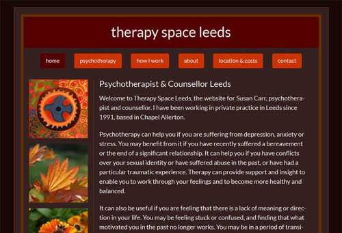
Susan wanted to retain the vertical bar of square images on larger screens as seen in the screenshot here.
This 2 column layout works well on larger screens but, clearly, this arrangement would not be suitable for smaller screens where a single column would be needed.
Also, the menu bar would need to be changed as the horizontal arrangement of menu items would not be suitable for smaller screens.
Image Placement
In the design phase we settled on three different layout options for images.
- On the smallest screens images would be centred in the single content column (see image below)
- On mid-sized screens (tablets and the like) the images would be right aligned and embedded in the paragraphs.
- On the larger screens, as we have seen above, the images are arranged in a vertical bar on the left of the text content.
There were one or two pages where the content was not sufficiently extensive (e.g. contact page) to embed the images in the text on mid-sized screens.
Navigation

The horizontal arrangement of menu items works well on larger screens but on smaller screens we chose to use a simple menu button which, when tapped would reveal a menu of items sliding down vertically as you can see in the next image.
This is easy to use and looks professional.
Testing
As ever, we carried out extensive testing of the new site on a wide variety of devices, operating system versions and browsers to ensure that the layout and function of the site even on quite old phones, tablets etc. The value of taking this thorough approach proved itself when we found a peculiar layout problem with an older version of an iPad. Everything was fine on newer iPads and, strangely, on even older versions than the one with the issue. A couple of lines of code solved the problem but we would not have discovered the bug had we not tested the new site on all the different generations it has been through.
Feedback
Susan was very pleased with the new site and here is what she had to say about the project…
I have used AttractMore for several years now. I highly recommend their work – they’re real experts. They let me relax as I know I can hand over all the technical stuff to them and that it will all be rapidly sorted out and my website will look good and work really well. They are always reliable, efficient, conscientious and thorough and very straightforward to deal with.
Final Thoughts
Thoughtful design and proper testing are essential components in any website project that aims to create a site that works well on all devices and which serves a business well. Although this requires additional effort, the quality of the end product is higher which will reflect well on the business.