Summary
There are some elements that pretty much every business website should have and, in this post, we will take a quick look at each one. Here’s the list:
- Have a purpose in mind for your site
- Have a design that is consistent with your price point
- Create a pleasant, easy-to-use experience
- Build a structured navigation on both wider and smaller screens
- Avoid stock images of people
- Make your site accessible
- Have a decent About page
- Use testimonials
- Keep it updated
- Include contact details
- Bonus for online shops
Intro
Visitors expect business websites to be clear and to provide the information they are looking in an easy-to-use manner. As a business owner, you want visitors to contact you or buy from you or a number of other actions and, to do that, you need to create a sense of trust.
The items below are intended to achieve all these objectives. First impressions are important, so it’s well worth putting some thought into how to create a good one.

1. Have a purpose in mind for your site
It can be helpful to put some definition around the purpose of your website. Without some goals, how will you know if it is doing a good job? Delivering a reasonable ROI? I appreciate that it can be difficult to be precise about numbers, but something is better than nothing.
The purpose of your site could be one (or more) of the following:
- Lead generation (how many new leads in next 12 months?)
- Brand awareness (can you measure this?)
- Increase sales (by how much in what time frame?)
- Increase average order value (by how much in what time frame?)
- Sell more product X (how many more in what time frame?)
If you can put some numbers (or even a range) on the objectives for your site, you’ve got something to measure against and then refine. You’ll have a better idea of how your site is performing and whether changes are needed.
2. Have a design that is consistent with your price point
Your website is not for everyone - it is intended for your target audience so you know must know your target audience (or audiences) and adapt your website to their needs. When this is mentioned, it is usually in the context of writing content to address the needs of the target audience, however, it is equally important to design for your target audience.
Many years ago, we were engaged by a local business that designed and made wedding dresses and other bespoke garments. they were not a large organisation but did a great job at reasonable prices. There was a temptation on the part of the owners to have a new website that looked like the sites presented by the exclusive, premium wedding dress designers. However, those sites had a different target audience and, after some discussion, the client appreciated that, if they had a design appropriate for a high class company it would alienate the very people they wanted to attract.
So, don’t have a super-sophisticated website which gives the impression of offering a premium service to clients if your price point is mid market. Likewise, don’t have an average looking website if you are offering a premium service. Consistency between website and business is key, so you are fulfilling customers’/clients’ expectations and there’s no mismatch. What you present on your website (and elsewhere, of course) should truly represent your business.
3. Create a pleasant, easy user experience
This is a fairly obvious requirement but how often does a website provide this? Here are a few factors to consider:
- a limited set of agreeable colours that harmonise with each other
- sensible use of space so the pages don’t appear cluttered
- readable text - big enough and with sufficient contrast against the background
- aims to fulfil the purpose set for the website
- (and my personal bugbear), avoids (or limits) the use of pop ups to encourage subscriptions etc., especially when it’s difficult to find the close button. They’re irritating and distracting and unlikely to give a good impression to your site visitors.
4. Build a structured navigation on both wider and smaller screens
Think about the different pages on your website and have a logical structure. Consider how a visitor might move between the pages toward fulfilling the goals you have set for your site.
It is likely that most of your site visitors will use a mobile phone to access your site (true for most sectors, but not all) so the navigation on mobile needs to be clear and easy. Ensure that the menu choices have enough space between them so people don’t accidentally tap one option when they intended to tap the adjacent one. Don’t have too many menu levels as it soon gets confusing and people can feel ’lost'.
5. Avoid stock images of people

Having images on your website is generally a good idea to add interest and break up the text, however, images such as the one above, do nothing for the reputation of your business as they are so obviously fake and are not a true representation of your business.
Likewise, if you’re a solicitor, accountant, financial adviser don’t put images of large, glass office blocks on your website, unless that’s where your office is located. Again, consistency between your website and your business is important.
6. Make your site accessible
In the UK, at least 1 in 5 people have a long-term illness, impairment or disability, and many more have a temporary or situational disability. (UK Government blog post)
Some of these impairments will affect how users interact with your website, for example
- colour blindness (various types)
- motor impairment e.g. inability to use a mouse. Could be permanent or a broken wrist, for instance.
- blindness
However, it’s entirely possible to create a website in a way that allows it to be used without a mouse, that uses colours that are acceptable for people with various forms of colour blindness and which can be read out to a blind person. To my mind there is a moral obligation to do that, but there is also a strong business rationale - why deliberately exclude 20% of your target audience by creating a website that does not work for this group?
These days, there is a great deal that can be done to make websites accessible to all so, why not make that happen?
7. Have a decent About page
Based on the web stats for the sites we look after, About pages tend to get a good number of visitors. In general, it seems, visitors to websites want to know something about the people behind the business they’re looking at. They want some background, some history, some reason for being, something they can relate to, some human connection. They don’t want a CV or a series of bland corporate statements.
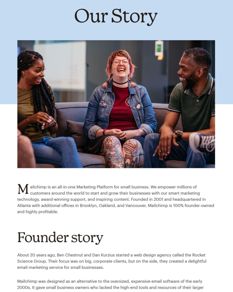
Mailchimp have a quite extensive About page which sets the tone through the main image, then describes what they do before moving on to talk about the founders and how the company came into being.
The About page for Amnesty International again has a striking image followed by a description of what the organisation’s aims are. It then moves on to talk about how it all started and how it has evolved.
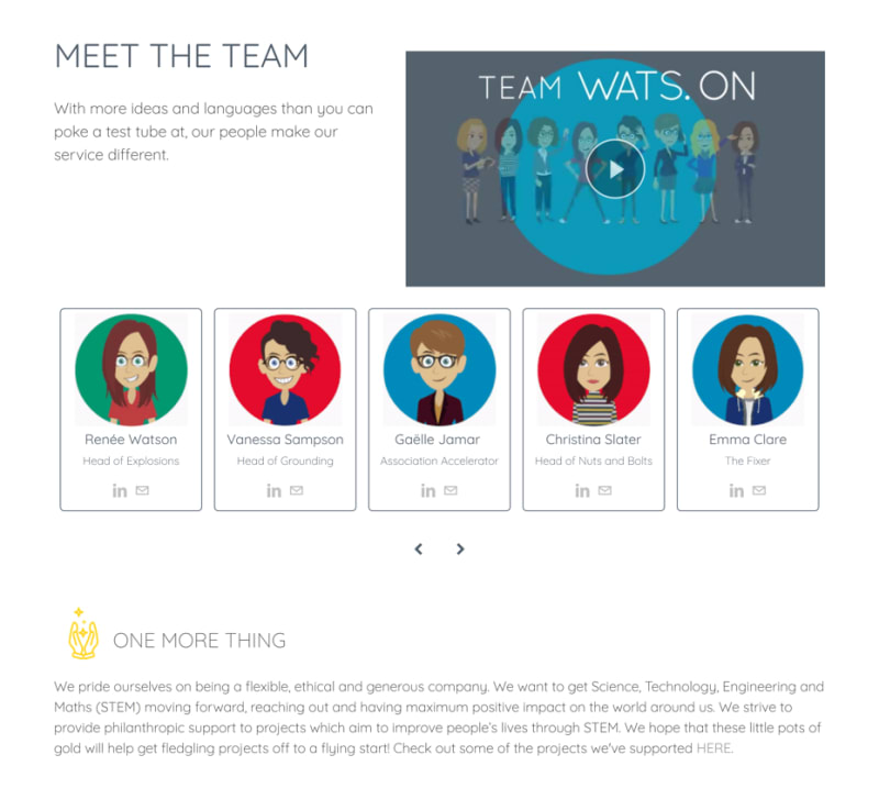
An about page is the place where your business can really differentiate itself. Some businesses display a photo of each one of the staff together with some brief info about them. In my view, this works well if also accompanied by some info on the background of the company itself. Here’s an example that uses cartoon representations of the people.
8. Use Testimonials
Testimonials help establish the credibility and trustworthiness of the products or services your business offers. Don’t add a page of testimonials to your site: instead, put relevant testimonials is various places around the site. Home, Contact and About pages would be a good place to start.
To some degree, people suffer with testimonial fatigue and some scepticism as well, so simple text testimonials with limited or no attribution, may not carry much weight and can look fake. If you can add the name of the person giving the testimonial and include a picture of them, so much the better. If a picture isn’t available, the logo of the company they represent would be OK.
Video testimonials are, of course, the most trustworthy but also the hardest to obtain. If this is appropriate for your business, the effort involved in create a short video for a few people, may well pay dividends.
9. Keep it updated
If your site contains a blog, when did you last post something? If it was more than a couple of months ago, this could give visitors the impression that your business is closed or, at least has stopped trading temporarily. The opposite may be true - it could be that you are so busy that you have no times to publish blog posts, but that may not be apparent on the website.
If you have an online shop and you’re still showing Valentine’s offers at the end of February, or worse still, offering Christmas products, again, people could be forgiven for thinking that your business may be closed.
Keep the content on your site up to date to reassure website visitors that your business is still alive and well.
10. Include contact details
Contact details are essential for customers whether that is a contact form, a chat facility or a phone number. Don’t hide these details away - make them obvious if you expect customers to contact you. You’d be surprised at how many companies don’t do this.
11. Bonus for Online Shops
Make sure you have a page about deliveries; what method(s) you use, how long it’s likely to take, can they deliveries be tracked etc. If appropriate, have another page about refunds and returns.
These pages give customers more confidence in your online shop so, again, don’t hide them as small text in the page footer.
Conclusion
To help convert visitors into customers/clients, your website needs to create a sense of trust and confidence. By providing a clear, structured, well-design site with relevant information you can instil that trust and more easily guide visitors towards the actions you want them to take to help fulfil your business objectives.
First impressions count, and if your site doesn’t provide what visitors want, they will go elsewhere. Best to make sure that doesn’t happen.
If you’d like any assistance in the design and structure of your website, please contact us.