Some Mobile Usage Statistics
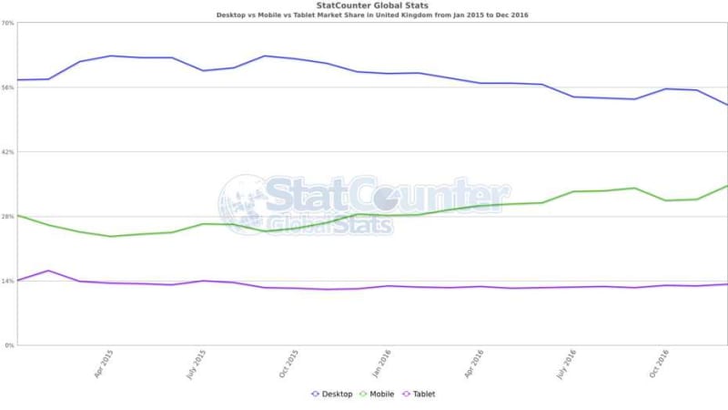
You will be aware of the increase in mobile usage, especially smartphones, to access the internet but the following graph (from StatCounter) clearly shows how desktop usage is declining, smartphone is increasing and tablet usage is almost static. These are figures from the UK for the period January 2015 to end December 2016. Smartphone and tablet users combined account for 47.83% of the total and the trend continues upward.
Expanding the view out to worldwide, a different picture emerges with mobile usage now exceeding desktop usage.

Although these figures may not directly apply to your site, the increasing smartphone usage suggests you should seriously consider how your site appears and performs on these very varied devices.
Mobile Friendly?
One simple way of checking whether your website is mobile-friendly is to use the following two tools from Google.
- https://search.google.com/test/mobile-friendly
- https://www.thinkwithgoogle.com/marketing-strategies/app-and-mobile/mobile-tools-to-optimize-site-and-app/
By entering your website address, Google will check your site and let you know of any basic mobile deficiencies. The second option is better as it gives feedback on page speed.
Speed Up Your Site
If your site is slow to load, visitors will leave so it makes sense to take targeted action to improve page load times. There are tools available to determine where bottlenecks are so these areas can be addressed as a priority. Page load speed is also a factor Google uses in ranking search engine results. If a page is slow to load Google will not rank it as well in its search results.
A future post will address this in more detail.
Accelerated Mobile Pages (AMP)
AMP is a Google initiative to help web pages load faster on mobile smartphones. AMP achieves its gains by setting out stringent requirements for AMP enabled pages. However, given that mobile response times can be longer than for desktop sites on fast WiFi connections, there are benefits to your site visitors in AMP-enabling your pages. I would expect that Google will give such pages a boost in rankings at some stage soon. Although this has not been announced, it would follow a pattern that Google has used with other technology features.
Google Mobile First Index
As most searches these days are carried out on mobile devices, Google is going to change how its search index is managed and updated. To quote from the Google Webmasters Blog:
“Although our search index will continue to be a single index of websites and apps, our algorithms will eventually primarily use the mobile version of a site’s content to rank pages from that site, to understand structured data, and to show snippets from those pages in our results.”
This is another compelling reason to get your website properly set up for mobile devices.
Conclusion
Because of the major importance of people using mobile devices to access products and services on the web, it is worth reviewing your mobile strategy to ensure you are offering the best service to your site visitors. Having a mobile enabled site is no longer sufficient – performance of pages on mobile devices is crucial both for visitors and search engines.
If you would like any assistance in implementing these features on your website, please do get in touch.