Browsers are not all the same and they are not always consistent in the way they display a web page. A page that displays OK on Firefox, may not look the same on Chrome and the layout may not be what is expected - or vice versa. Also different versions of the same browser may show the same page in slightly different ways. A page in Chrome 85 on an Android phone, may not show in the same way as the same page in Chrome 85 on an iPad, for instance.
It’s annoying, but it’s a fact of life and always has been for as long as browsers have been around. The differences from one browser to another aren’t usually that large but they may be enough to disrupt how a page is laid out or how it works. There are usually a few changes we can make to the code to fix any problems so that everything ends up looking good.
The value of testing
Because of these inconsistencies, we always test new websites (and changes to existing sites) thoroughly before they go live and make any necessary changes, so we can be sure that, whatever device a visitors choses to use, the site will work correctly. There are more details about our testing arrangements on our Website development and website testing page
A surprising result
Recently, when testing a full re-implementation of this website, something unusual happened.
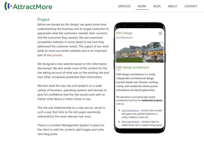
We expected that paragraphs of text would display alongside an image as in the screenshot below.
What we got was rather different. See the screen shot below.

The first line was alongside the image, then there was a large gap before the remaining text displayed below the image.
Similar behaviour occurred on other pages. We were testing on the latest version of Chrome (version 87 at the time of writing) and we tried several ways to fix the problem but we could not get the text to display alongside the image. We then tried with Firefox, Opera and Safari and everything displayed as it should in those browsers even in several different versions.
We then tried earlier versions of Chrome and, to our surprise, everything was fine! The problem ONLY happened in Chrome 87 and Microsoft Edge 87 (both have the same underlying browser software).
Explanation
The only explanation for this was that we were seeing a browser bug, i.e. a fault in the latest versions of Chrome and Edge so we raised this issue with the Edge team who confirmed that it was, indeed, a bug. Reassuringly, this was picked up quickly and a solution found. At present, it’s not certain that the fix will go into the next version of Chrome and Edge or not, but if not the next version (version 88), certainly the following one. We do, however, have a work-around for the problem which prevents large gaps occurring when text is placed alongside images.
Conclusion
This is a first for us - we’ve never discovered a browser bug before. However, we have certainly come across plenty of browser inconsistencies in our time, which is why we will always test new and changed sites to make sure they work well and display properly on all devices. Only by doing this can our clients be assured that their website will work properly across different browsers, different versions of those browsers and with different devices, operating systems etc.